Roebuck Scuba Hands-on (p)Review
This is my first time writing about Roebuck Watch Co. and while I was familiar with the name from the Microbrand Watches group, I never had the opportunity to handle one of their watches, until now. Guy Roebuck, the founder, offered to lend me a prototype from his upcoming diver collection, Scuba, that is scheduled to be launched on Kickstarter on July 6, 2021. The Scuba will be the second Roebuck collection after the brand’s debut with the racing-inspired Divisio.
The Scuba will have four colour combinations, grey dial with red bezel, blue with orange, red dial with grey bezel and a green model that will be offered as a stretch goal.
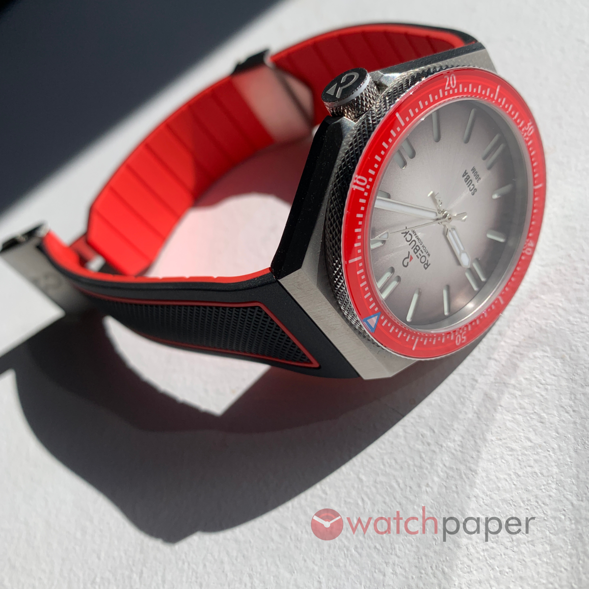
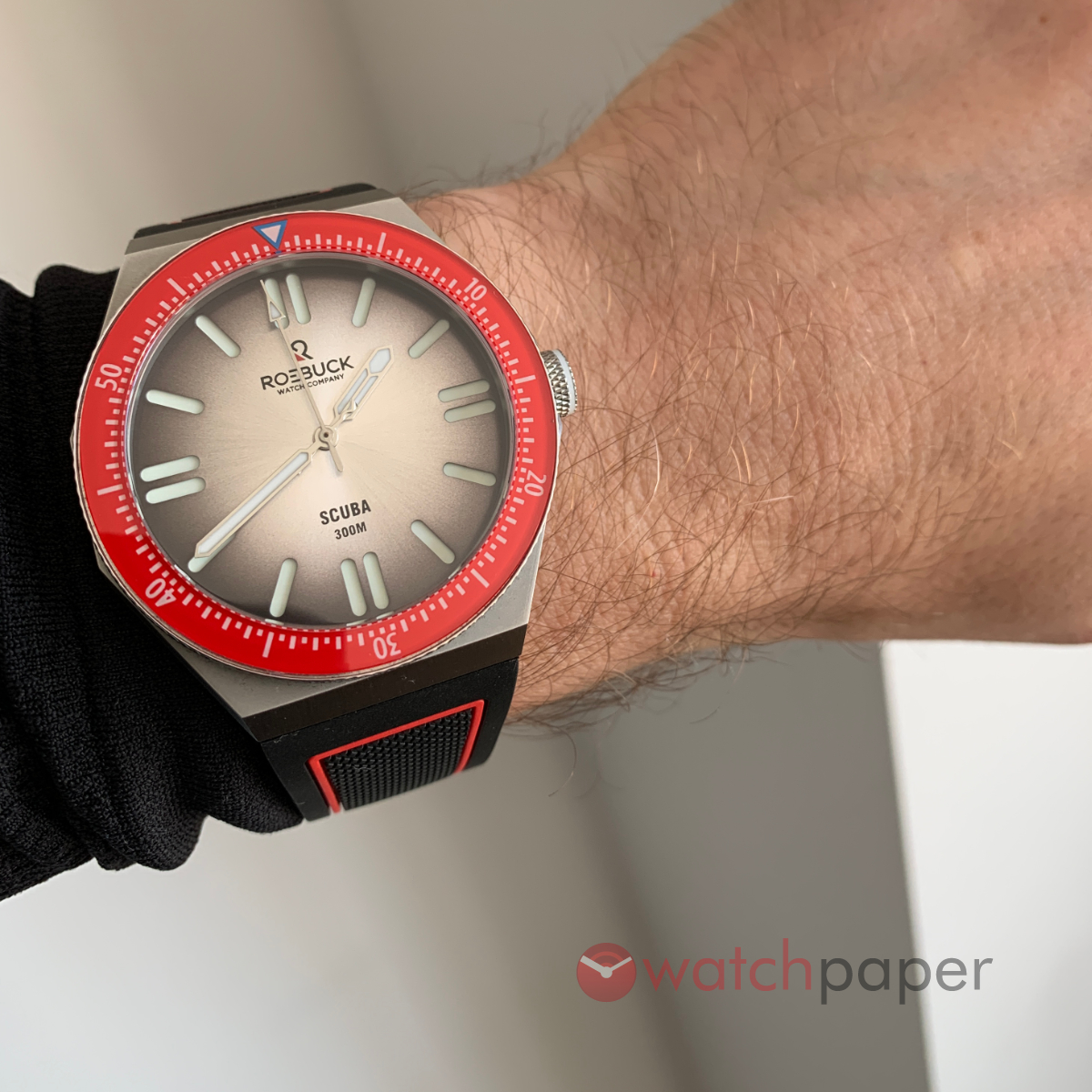
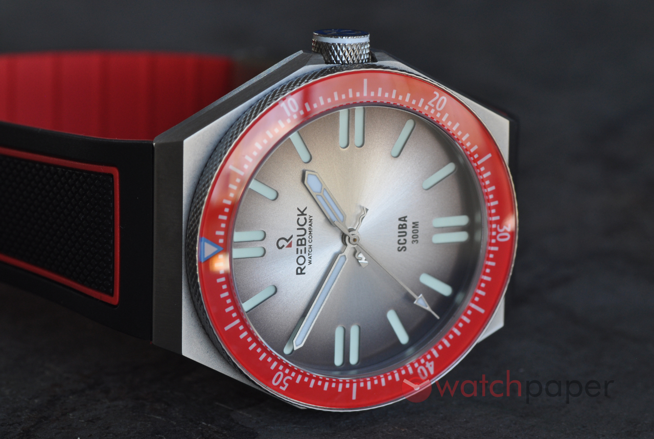
For this review, Guy sent me the grey dial / red bezel model and this was another first for me. While many watches that I had the pleasure to review, own or just try on for a wrist shot, would have red accents here and there, to make them sportier, this Roebuck Scuba is the first one to have red as the dominant colour and it was an eye (and hearth) opener for me, as soon as it went on my wrist, I was wondering, how come red is not used more often? I don’t mean burgundy or other toned-down hues of red, but bright, in-your-face, blood-red, that sports-car red that screams the joy of life and virility, because this Scuba does just that.
By looking at the specs, the diameter of 42 mm would almost be considered on the larger extremes according to this recent trend of smaller watches, but on the wrist, even if it measures 47.5 mm, it does not feel and look like a big watch. Why? There are no lugs and its thickness is only 11.75mm, which is quite impressive for a watch that has a water resistance of 300 m. The shape of the case has this minimalistic, almost spartan look with its straight lines, sharp angles, everything reduced to the functional minimum.
The rotating bezel has a gorgeous knurled finish, same as the crown, both sparkling in contrast with the brushed surface of the case. Talking of the crown, I have to say that this watch packs a few surprises that to me speak a lot about the passion of its designer to create a watch with a soul. One of these Easter eggs is the lume filled ring on the crown. While you won’t notice it immediately, as it gets darker, the crown will reveal its hidden feature. I already praised the red colour of the bezel, but here comes my only criticism of this watch, that little blue outline of the triangle marker on the bezel makes no sense to me, but to be honest, it is such a tiny detail that I don’t think takes away anything from the overall qualities of the watch.
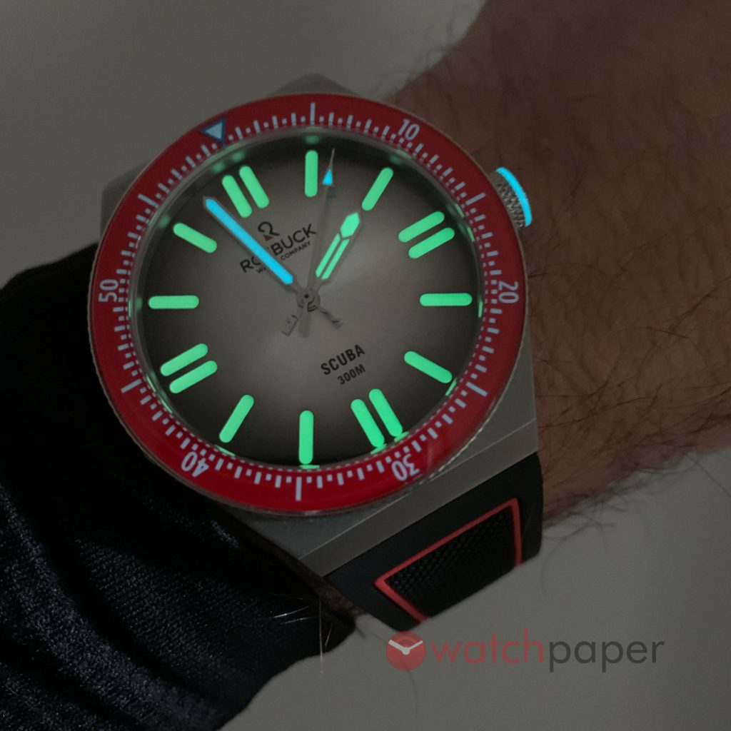
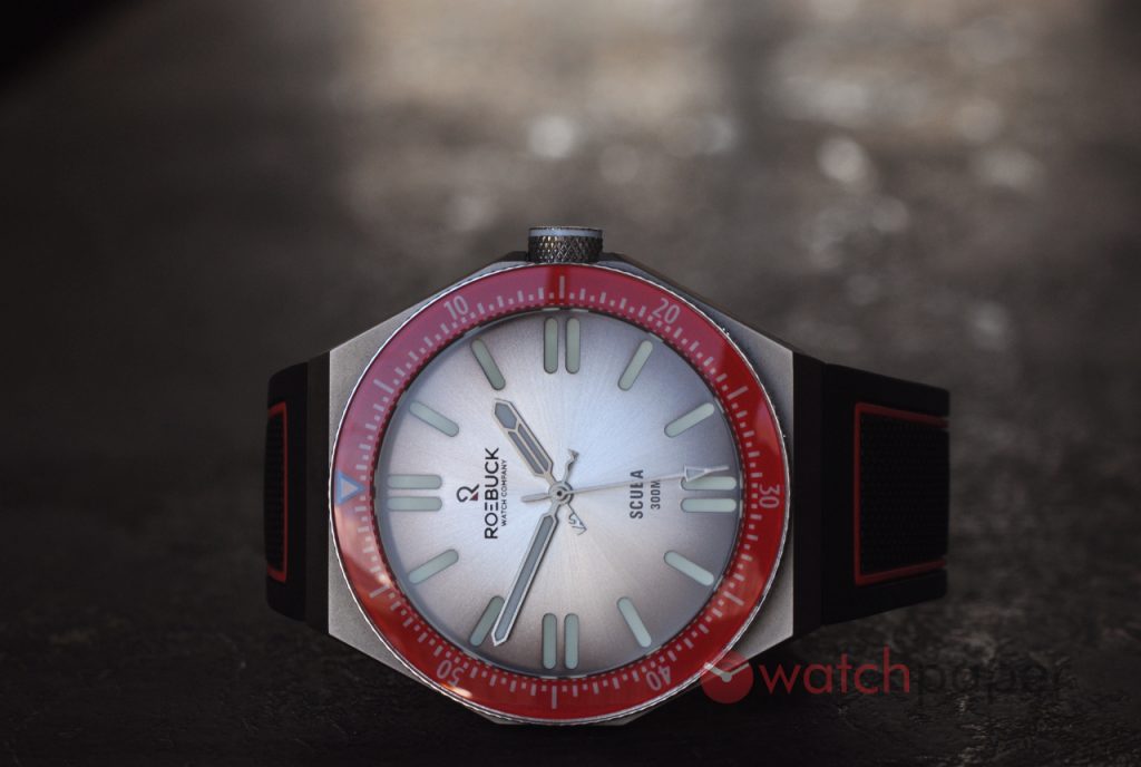
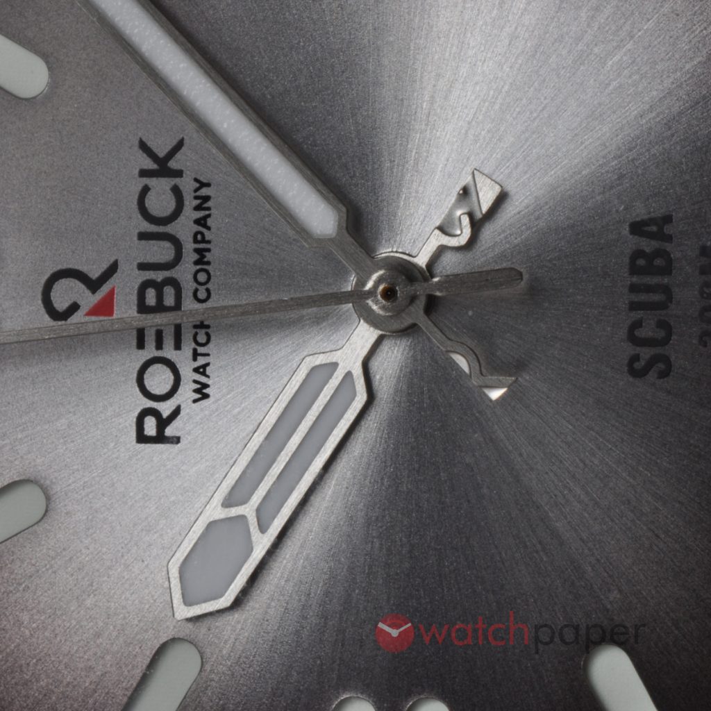
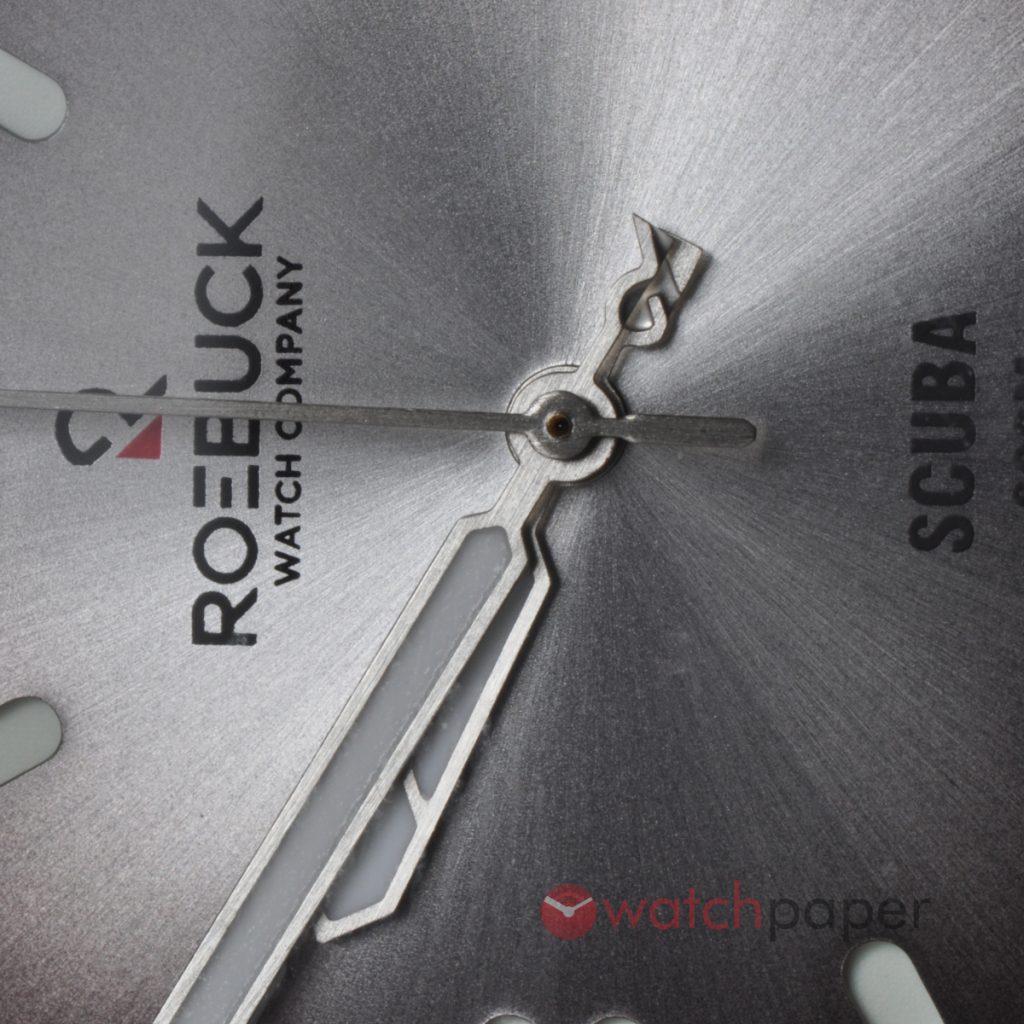
The dial is another masterpiece of design, the grey gradient with its sunburst finish is the perfect colour and texture to go together with the case and as you can see it is a sandwich dial with a generous coating of C1 lume. This watch is super bright! Taking these lume shots was really easy, no tripod or other tricks, it just shines.
Here is another Easter egg, again something that only the initiated will know about and once you discover it, oh boy, the hands of this watch are so much fun! The minutes and the hour hands when they meet, once every hour, just for a moment, will reveal the Roebuck logo.
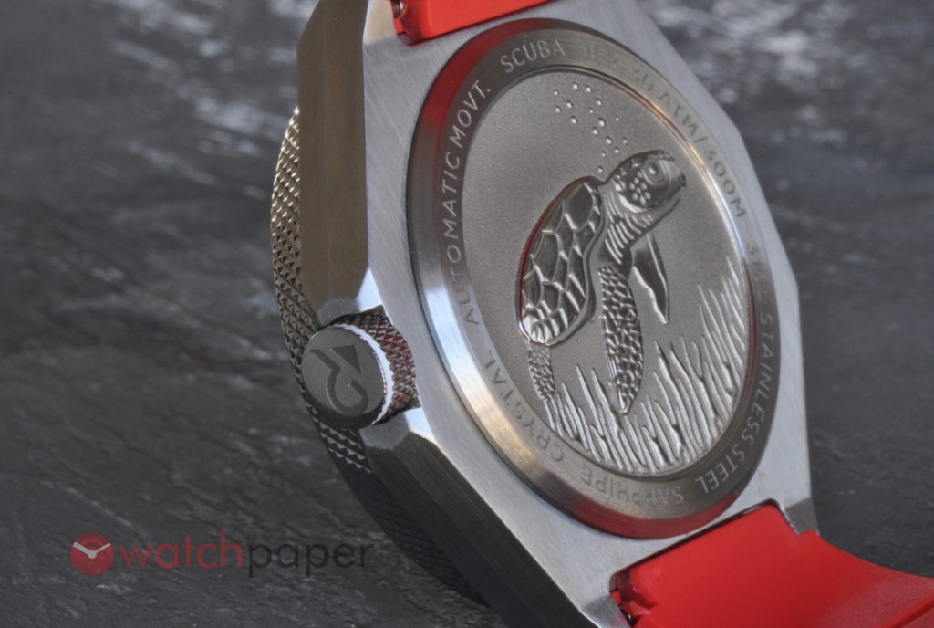
The back of the watch has a beautiful 3D sculptural representation of a sea turtle and some corals. While working, I had the watch on my desk turned around just to admire this beautifully designed back and just by judging from the sheer amount of pictures I took of the turtle, I think the back is among my favourite parts of the Scuba.
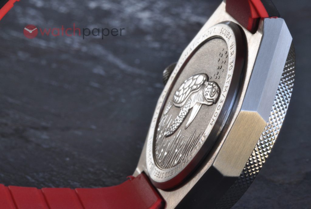
Behind the turtle, you will find a Miyota 90S5 or 9015 if you go with the date version. I really liked the rubber strap and while I had to struggle a bit to adjust the flip clasp, once everything was in place, I loved the use of the red theme.
As I mentioned, the Kickstarter campaign is booked to launch on July 6, and the early bird pre-order price will be $400 USD instead of the full retail of $600 USD. I have good feelings about this campaign, while the diver segment seems saturated, there is always a place for something outstanding and original. For more about Roebuck Watch Co, visit www.roebuckwatchco.com