Huckleberry & Co. Atticus — hands-on review
Huckleberry & Co. Atticus
The Internet is flooded with minimalist, “Bauhaus-inspired” watches. The vast majority are dull pieces with an uninteresting design copied ad infinitum. As a huge fan of the Bauhaus school of art, it is really painful for me to observe the modernist ideal of simplifying forms and maximising functionality to be butchered at such a large scale.
From time to time, there is a brand, a collection, or a watch that in its minimalism it is exceptionally refreshing, new and original. When Huckleberry & Co. approached me to have a closer look at the prototype of the Atticus collection, at first I was thinking, OK, here we go, another “Bauhaus” watch. Once I saw the pictures attached to their email, my response was an enthusiastic “YES”!
Huckleberry & Co. Atticus
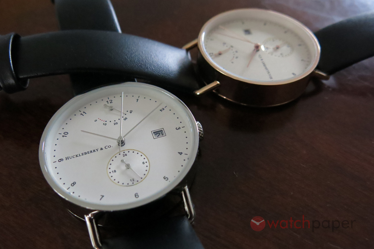
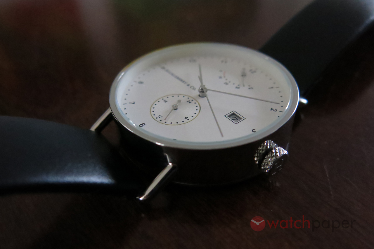
When the package got finally delivered, I was pleasantly surprised to discover both versions of the Atticus: the stainless steel and the rose gold PVD. The first thing that struck me as I was unpacking them, when I wanted to set the time and date, I immediately appreciated the existence of the 24 h subdial at six o’clock. As TimeCaptain explained in his blog, Never feed them after midnight, it is not a good idea to set the date between 8 PM and 8 AM. Thanks to the subdial, I could safely adjust the time and date and wind the watch in all safety. As I was winding the watch, the little power reserve indicator was moving up and the second hand started its smooth dance around the dial. Because of the way the crown is placed on the 10 mm high cylinder shaped case, I found that winding was a bit difficult. I would have loved the crown to be a couple of mm thicker so that I can have a better grip.
Huckleberry & Co. Atticus
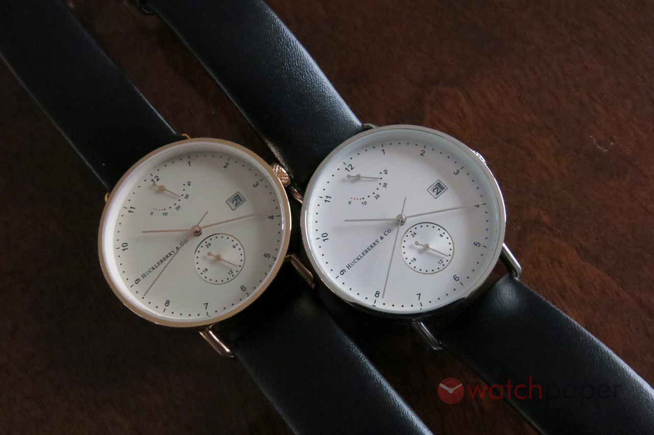
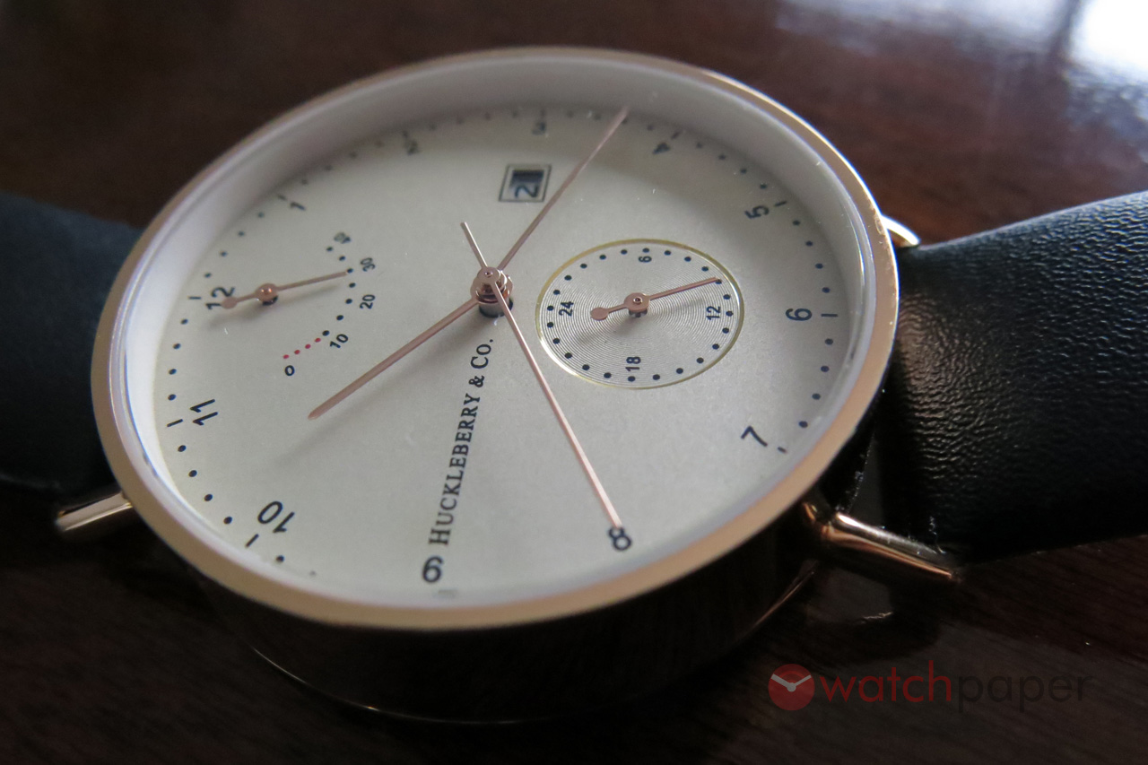
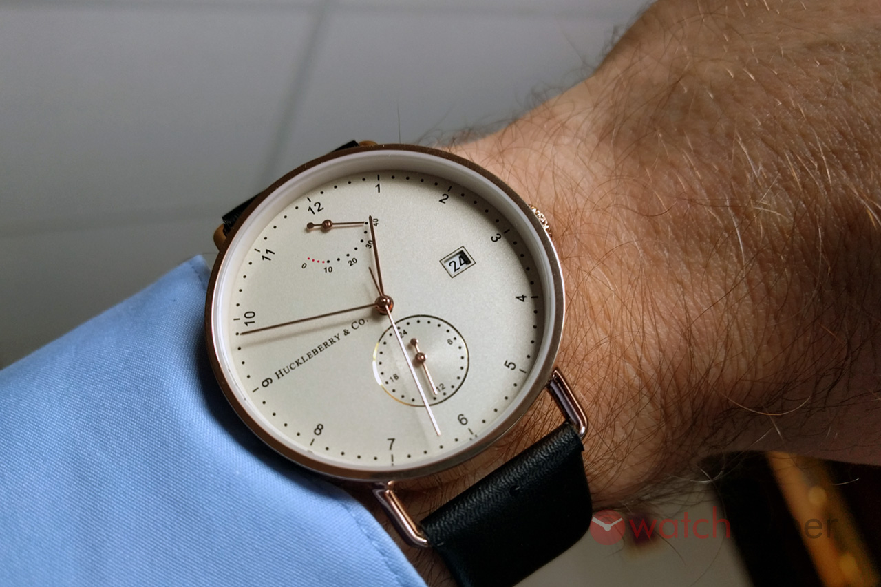
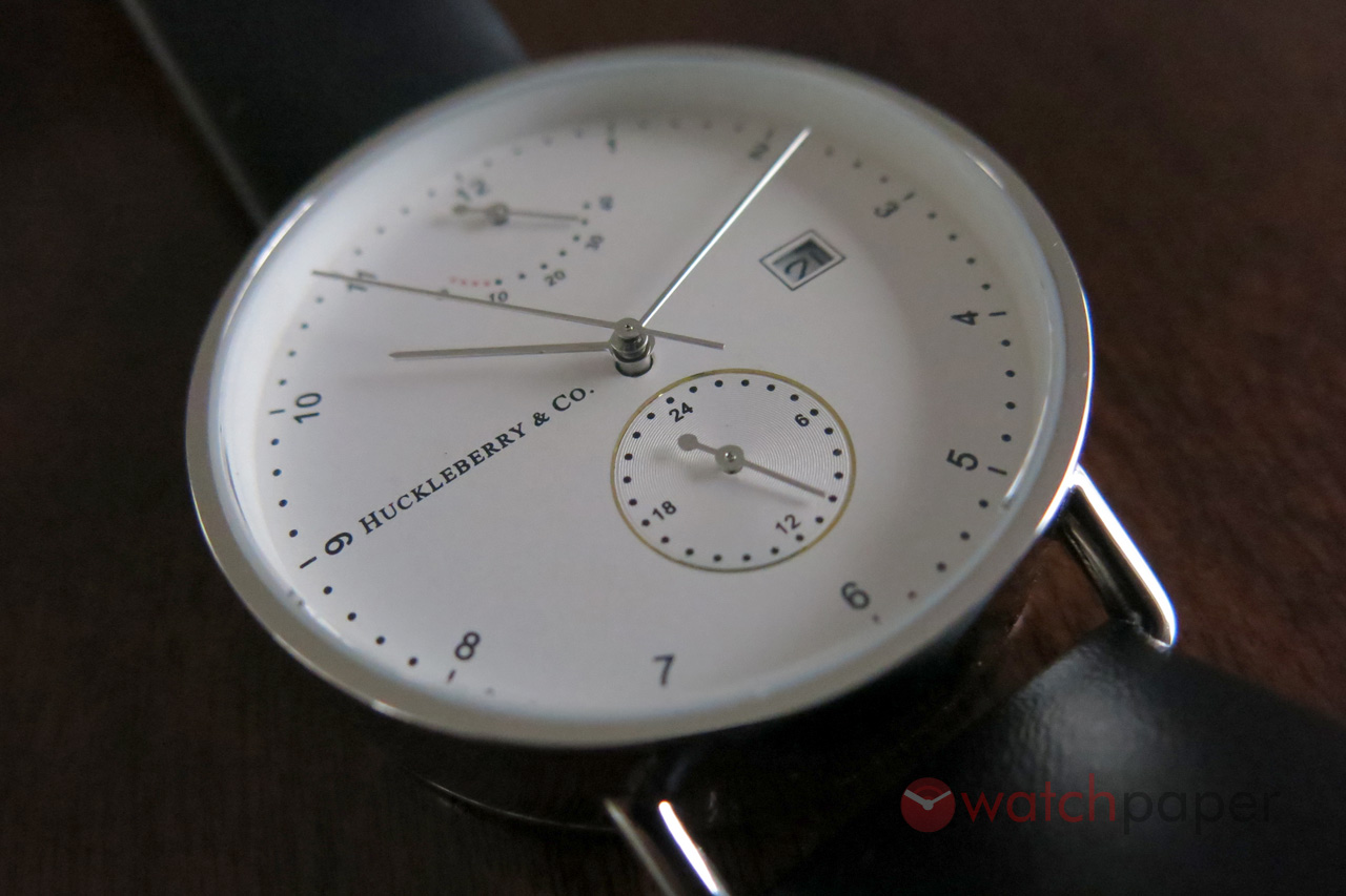
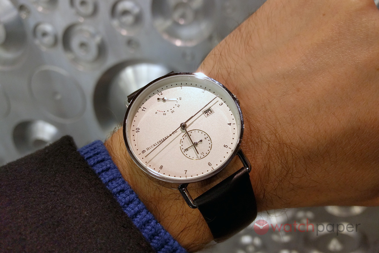
Now that the watch is running let’s take a look at the dial because the Atticus is all about the dial. The stainless steel version comes with a white dial, while the gold paved version has a slightly warmer tone. All the marks are printed and the only element that breaks the flat surface of the dial is the subdial surrounded by a circle matching the colour of the case. I fell in love with this delicate and subtle design element that would shine for a short moment, depending on the angle of the light as it hits the dial.
A closer look at the dial of the Huckleberry & Co. Atticus
Despite all the action happening on the dial — power reserve at 12, date window at 3 and the 24 h subdial at 6 o’clock — there is a lot of empty space on it. This is achieved thanks to the tiny fonts used for the numerals, and the delicate stick hands. The logo, at 9 o’clock, is barely readable, but it balances nicely the date window at 3 o’clock.
The date window is the only thing I would change on this dial. I really don’t understand the choice of adding a thin black contour around it. It just doesn’t make on this gorgeous dial that has so many delicate parts. It’s unnecessary and it breaks the harmony of the watch. I would have preferred it to be completely removed, or if there is a need to highlight the date to use the same metal contour as around the 24 h subdial.
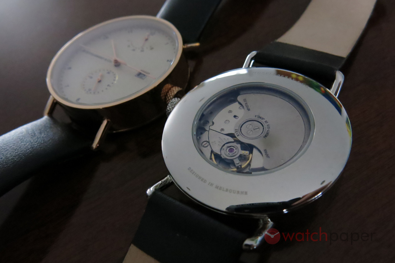
The see-through back of the Huckleberry & Co. Atticus
The other side of the watch will reveal a see-through back which is tiny compared to the case and leaves plenty of space to be used for decoration, but here too Huckleberry prefers to remain discreet. Larger fonts, a bit more boldness and courage won’t hurt it. I’m also a believer and a preacher of customized movements when it comes to see-through backs.
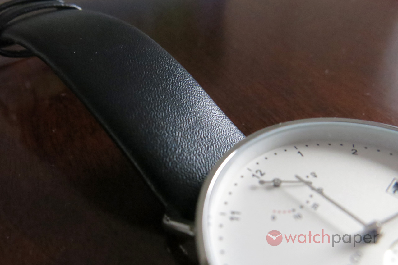
The soft leather strap follows the minimalist design of the Atticus
Both prototypes came on a black leather strap, with a fine texture that completes the modern allure of the Atticus. No fake crock patterns, just honest simplicity. They are soft and comfortable. I suppose when it will get into production people will have the option to chose between black or brown, especially when it comes to the gold PVD version. While it looks great with the black, for the gold model a brown strap would work even better.
The Atticus is still in the prototype phase and I think it is very close to being the perfect Bauhaus watch. My review might look harsh, but I’m criticising minor details that Huckleberry could easily correct.
The gold plated Huckleberry & Co. Atticus
I applaud Huckleberry & Co’s choice of a movement that we don’t see often and they managed to package it in a great looking timepiece. I really liked the way the Atticus looked on my wrist and I was lucky to have both of them because my wife — who is not into watches — always wanted wear one. It looked just as good on her wrist too. I guess this is the beauty of Bauhaus watches, their modernity makes them appealing to both sexes.
It is not surprising that as soon as Huckleberry went live with the Atticus on Kickstarter, it got funded in six hours and since then, their fundraising is going strong. You still have time until December 22nd to pre-order your favourite model, or for that matter just to be safe and avoid arguments with your partner, order both of them. Shipping is expected around May 2016.
Update (February 4, 2017) — At the time of writing this review, the collection was called Archibald, but to avoid confusion, I updated the review with the current name, Atticus.
Huckleberry & Co. Atticus
Technical specs
Case: stainless steel
Diameter: 40 mm
Height: 10 mm
Lug width: 20 mm
Crystal: sapphire
Movement: automatic Miyota 9132
Functions: hours, minutes, seconds, 24-hour dial, date and power reserve indicator
Water resistance: 5 ATM
Strap: black leather
Price: $410 AUD Kickstarter pre-order / $490 AUD retail
Huckleberry & Co. Archibald on Kickstarter
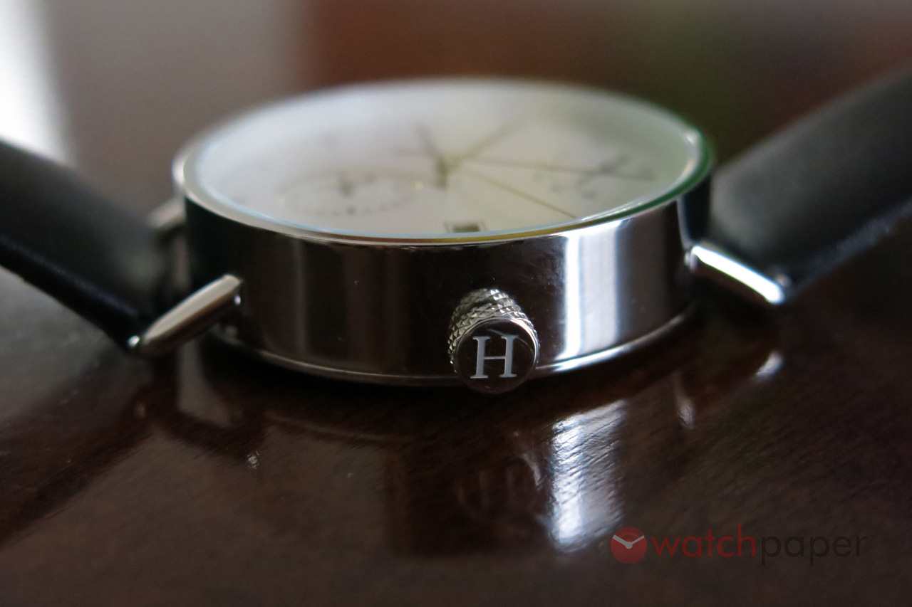
A profile view of the Huckleberry & Co. Atticus
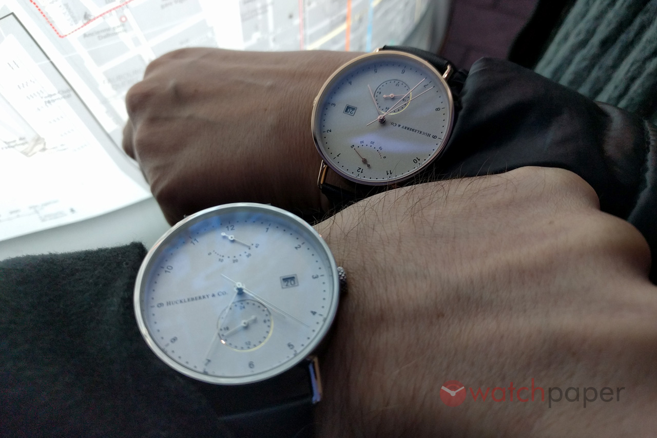
My wife and I, plus a couple of Atticus
Huckleberry & Co. Atticus